Market Basics · beginner · 6 min
What Is a Candlestick
Open a chart in Visor and the price history is drawn as a row of little coloured bars. Each of those bars is a candlestick, and each one is a compact summary of everything that happened to price over one slice of time. Learning to read a single candle is the first literacy step — almost every other chart lesson assumes you can look at one shape and know what it says.
Four prices in one shape
A candlestick covers a fixed period — one minute, one hour, one day, whatever the chart's timeframe is set to (see Timeframes). Over that period it records exactly four numbers, together called OHLC:
- Open — the price at the start of the period.
- High — the highest price reached during the period.
- Low — the lowest price reached.
- Close — the price at the end of the period.
The candle draws all four at once. It is not one price; it is a range with a beginning and an end.
The body and the wicks
The candle has two parts:
- The body is the thick rectangle. Its top and bottom are the open and the close — the two prices that bracket the period. The body shows where price began and where it settled.
- The wicks (also called shadows or tails) are the thin lines poking out above and below the body. They reach up to the high and down to the low — the extremes price touched but did not hold.
Colour tells you the direction. By convention a candle whose close is above its open is drawn one colour (often green or hollow) — an "up" candle — and one whose close is below its open is drawn another (often red or filled) — a "down" candle. So at a glance the colour says which way the period finished, and the body length says by how much.
What one candle tells you
A single candle is a small story about a tug-of-war. A long body means price moved decisively from open to close. A tiny body with long wicks on both sides means price ranged around but finished near where it started — lots of movement, no resolution. A candle that opens low, spikes up, and closes back near its open leaves a long upper wick: buyers pushed, sellers pushed back, and the period ended roughly even.
That is the honest limit of it, too. A candle is a description of what already happened in that period — four facts about the past. It is not a prediction. A long green candle tells you buyers were in control for those bars; it makes no promise about the next one. The named patterns you will meet later (engulfing candles, dojis, hammers) are just recurring candle shapes people have given names to — recognising one is reading, not a signal to act.
Reading them on the Visor chart
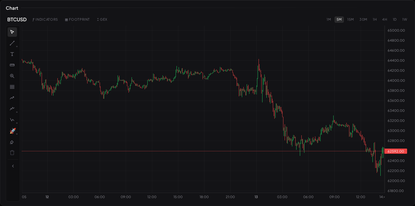
On the Visor chart widget, hover any candle and the exact open, high, low, and close appear in the readout. Switch the timeframe and the same history regroups into fewer, fatter candles or many thin ones — the underlying trades don't change, only how they're bucketed. That regrouping is the whole idea behind the next lesson.
One practical note: Visor's live quotes during internal validation are delayed and carry a freshness badge; a licensed real-time vendor replaces them before any public launch. The shape of a candle is unaffected — it's the timing of the very latest one you treat with that caveat.
What to read next
- Timeframes — why the same market looks different candle-by-candle depending on the period.
- Volume and Liquidity — the size behind the moves a candle records.
- Market Structure Basics — stringing candles into highs and lows.