Quant Methods · intermediate · 7 min
Correlation
Correlation is the single most quoted relationship in markets — "stocks and bonds are inversely correlated", "these two names trade together" — and also one of the most misunderstood. This lesson explains what the number actually measures, how Visor computes it, and, just as importantly, the things it quietly leaves out.
What the number means
The Pearson correlation coefficient measures how tightly two series move in step, on a scale from −1 to +1:
- +1 — they move perfectly together: when one is up on the day, so is the other, in fixed proportion.
- 0 — no linear relationship: knowing one day's move tells you nothing about the other's.
- −1 — they move perfectly opposite: one up, the other down.
Mechanically, it is the covariance of the two series (how much they vary together) divided by the product of their individual standard deviations (how much each varies on its own). That division is what rescales any pair onto the same −1…+1 ruler, so a sleepy bond index and a wild small-cap can be compared directly.
Returns, not prices — this is the trap
Visor's Correlation Matrix computes Pearson correlation on log returns, not on price levels, and the reason is the most important thing in this lesson. Correlating the raw prices of two trending markets reports a spurious value near +1 no matter what — because two lines that both drift upward over time will always look related, even if their day-to-day moves have nothing to do with each other. This is a classic spurious correlation, and it fools people constantly.
Working in returns strips out the shared drift and asks the honest question: on a given day, when one market moved, did the other tend to move with it? That is the co-movement that actually matters, and it is what the matrix shows.
Reading the matrix
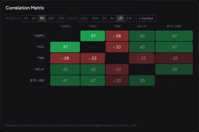
The widget is a symbol×symbol grid over a window you choose (30–250 bars) and an interval. Cells use a diverging colour scale centred on zero — green for positive, red for negative, intensity for strength — so a block of deep green tells you a cluster of names is moving as one. Click any cell to send that pair straight to the Pairs Analysis widget for a deeper look.
Interest-rate tickers sit in the grid alongside equities: over a recent daily window the 10-year yield (^TNX) runs meaningfully negative against the S&P — rising yields, falling stocks — exactly as a macro desk would expect, while the 13-week bill sits near zero because it is pinned by policy rather than trading with equities. (One honest caveat the widget states: yield tickers quote a level, so their "return" is a proportional change in yield, not a basis-point move — signs and relative sizes are sound, the raw number is not a bp figure.)
What correlation does NOT tell you
A single coefficient hides a lot, and treating it as the whole story is where people get hurt:
- It only sees straight lines. Pearson measures linear co-movement. Two markets can be strongly related in a curved or threshold way — calm together, violent together — and still score near zero.
- It is not stable. A correlation measured over 90 days is a fact about those 90 days. Relationships that look rock-solid in calm markets often snap toward +1 in a crash, when everything sells off together and diversification vanishes exactly when you wanted it.
- It is not causation. Two names moving together may share a driver, or it may be coincidence over a short window — the same reason a backtest needs the random control to separate a real signal from luck.
- Correlation is not cointegration. Two series can be 0.97 correlated on daily returns and still drift permanently apart in price. That gap is the whole reason Cointegration and Pairs exists as a separate tool.
None of this makes correlation useless — it is a genuine, fast read on how a book of positions hangs together. It just means the number is a starting point for a question, not the answer to one.
What to read next
- Cointegration and Pairs — why moving together is not the same as staying together.
- The Random Control — separating a real relationship from one that is just noise.