Reading the Tape · intermediate · 8 min
Liquidity Heatmaps
A DOM ladder has one blind spot: no memory. It shows the resting book now, and when size clears, the past is gone. A liquidity heatmap solves that by taking the same order book and painting it as colour across time — so instead of a single snapshot you see the whole history of where liquidity has built up, thinned out, and moved.
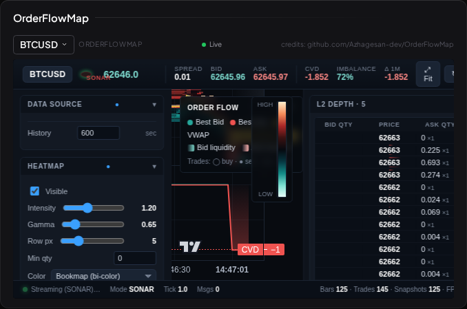
From ladder to map
Turn the DOM on its side and let it scroll. Price runs up the vertical axis, time runs left to right, and at every point the resting size in the book is drawn as a colour: brighter or hotter where more size is resting, dark where the book is thin. As time passes, each column of the book is recorded and slides left, leaving a trail. The result is a map of liquidity over time.
What that buys you is persistence you can see. A large resting order that sits at one price for minutes draws a bright horizontal band — a visible shelf of liquidity. When price approaches that band, you're seeing a level that has genuinely been defended, not just a number that flashed up once. When a band suddenly darkens, the size was pulled. When one lights up, size arrived. The heatmap makes the behaviour of resting liquidity legible in a way a bare ladder can't.
On top of the liquidity colour, executed trades are drawn as trade bubbles — dots placed at the price they printed and sized by how much traded (the time-and-sales prints, shown in context). So the map carries both halves at once: the resting book as heat, and the aggressive trades that hit it as bubbles.
The Visor view
Visor's heatmap is the OrderFlowMap widget (ofm) — the open-source OrderFlowMap application, vendored in as a widget and fed Visor's live crypto (Binance) order-book stream. (An in-house renderer was trialled against it side by side on the same market; OrderFlowMap won and is now the one heatmap view.)
It reads a live Level 2 feed, which in the current build is crypto order-book data — the venue where continuous free depth is available to read. And, as with the whole track: this is about reading the resting book as market information. The crypto feed is a data source for studying liquidity, never a suggestion to acquire the asset.
What a heatmap actually tells you
The genuine value is where size is resting and how it behaves as price approaches. A thick, persistent band that price keeps failing to push through is a level a lot of participants are willing to defend. Thin, dark stretches are prices that little rests at — regions price can travel quickly because there's not much to trade against. Watching a band hold, refill, or vanish as the market tests it is watching supply and demand negotiate in real time, and it pairs naturally with the level-based ideas in Supply and Demand Zones.
The honest cautions
Heatmaps are beautiful, and beauty is persuasive. Three things to keep firmly in mind:
- Colour is resting size, and resting size can be cancelled. A blazing band of liquidity is a wall of limit orders, every one of which can be pulled before price ever reaches it. A wall that disappears the instant price arrives may have been spoofing — or simply participants changing their minds. The heat shows what's offered, not what will fill.
- A visible wall attracts games. Precisely because everyone can see a big resting band, it becomes a target — for stops clustered behind it, for liquidity sweeps that run price into it to trigger those orders. Visible liquidity is not neutral; its visibility changes how the market treats it.
- The map is descriptive. It records where liquidity has been. A band that held five times can break on the sixth. Nothing in the colour promises the next test resolves the same way.
Reading it well
Used honestly, a liquidity heatmap is one of the best tools for answering a narrow, real question: at the level I'm already watching, is there meaningful resting size, and how is it behaving right now? A band that keeps refilling as trade bubbles eat into it is showing absorption. A band that pulls the moment price nears it was never real support. That read is genuinely useful — as a lens on a level you have an independent reason to care about, not as a signal that fires on its own. The Tape in Context is where that discipline gets its full argument.
What to read next
- Absorption and Exhaustion — reading a band that holds versus one that gives way.
- Spoofing and Fakes — why a bright wall of liquidity might not be real.
- Liquidity Sweeps — how visible pools of resting orders get hunted.