Reading the Tape · intermediate · 8 min
The DOM Ladder
The DOM — depth of market — is the most direct view of order flow there is. Visor's DOM ladder widget (orderflow_dom) shows the live order book as a vertical price ladder: prices running down the middle, and the resting order size stacked at each level. If What Is Order Flow was the idea, this is where you actually read it.
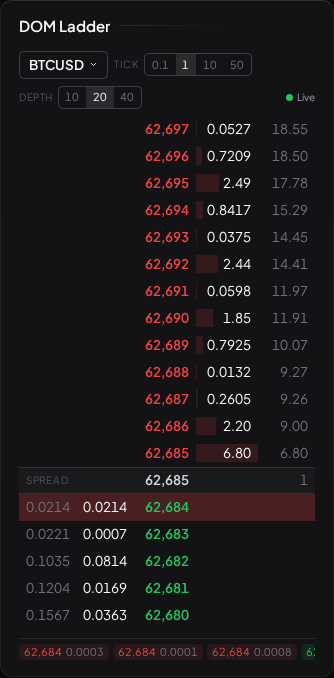
The shape of the ladder
Picture a column of prices, highest at the top, lowest at the bottom, with the current market in the middle. The ladder splits there:
- Above the current price sit the resting asks (offers) — limit sell orders, each waiting for a buyer willing to pay up to that level. The lowest ask is the best offer.
- Below sit the resting bids — limit buy orders waiting for a seller willing to hit that level. The highest bid is the best bid.
- The gap between the best bid and best offer is the bid-ask spread. In a liquid market it is one tick wide; in a thin one it yawns.
Next to each price is a number: the size resting there — how many contracts or units are queued to trade at that level. That size column is the real content of the DOM. Reading the ladder is reading where size is heavy and where it is thin.
What the size column is telling you
Heavy resting size at a level means many participants are willing to trade there. A large bid stack a few ticks below price is often described as "support in the book" — a lot of orders that price would have to consume before it could fall through. A large ask stack above is "resistance in the book." Thin size, by contrast, is a level price can slide across easily because there's little to trade against.
Two honest cautions come with this, and they matter:
- Resting size is a snapshot, not a promise. Every order on the ladder is a limit order that can be cancelled instantly. A wall of bids that looks like a floor can evaporate the moment price approaches it — the orders were never obligated to fill. This is the central problem of the whole book, and Spoofing and Fakes is devoted to it.
- The book only shows resting, patient orders. The impatient side — the market orders actually crossing the spread and moving price — does not appear as resting size. It appears as size disappearing from the ladder as it gets eaten. To see that consumption you watch the ladder change, or you read the Time and Sales tape alongside it.
Reading it as a live thing
A DOM is not a static picture; its whole information content is in how it moves. Watching a live ladder, a few things become legible with practice:
- Size being pulled — a large resting order that vanishes as price nears it. The participant blinked, or never meant it.
- Size being refilled — an order gets partly eaten, then tops back up to its original level again and again. Someone is defending a price, replacing what aggressors take. That's the seed of Absorption and Exhaustion.
- The best bid/offer walking — the top of the book stepping up or down tick by tick as levels fill and clear. That walk is the price moving, seen one rung at a time.
What Visor gives you here
The DOM ladder reads the same live Level 2 feed as the rest of this track. In the current build that is crypto order-book depth — the venue where continuous free L2 is available to read. As with everything in this track, this is about reading the book as market information; the crypto feed is a data source for studying depth, not a suggestion to trade the asset.
One deliberate limit worth stating: a single DOM shows the resting book now. It has no memory — once size clears, the ladder simply shows the new state, and you can't see what was there a minute ago. That memory is exactly what the Liquidity Heatmap adds, by painting the book's history as colour over time. Many readers keep the two side by side for that reason: the ladder for precision on the current book, the heatmap for how it got here.
The honest frame
A DOM is dense and fast, and its density can fool you into thinking it's predictive. It isn't. It is a live inventory of stated intentions, most of which are noise and some of which are deliberately misleading. It sharpens your read of a level you already have a reason to watch — where the spread sits, how much has to trade to move a tick. It does not, on its own, tell you which way the next move goes. Keep The Tape in Context in mind the whole time you read it.
What to read next
- Time and Sales — the aggressive side: trades actually printing, and who's crossing the spread.
- Liquidity Heatmaps — the DOM's history painted over time.
- Absorption and Exhaustion — when aggressive orders hit a wall in the book and fail to move it.