Using Visor · advanced · 8 min
The Volatility Smile
Black-Scholes assumes one volatility for every strike. The market flatly disagrees, and the Volatility Smile widget draws the disagreement: implied vol plotted against strike, one curve per expiry, off the live chain. The Implied Volatility lesson covers what IV is and why the smile exists; this is the guide to reading the widget and its controls.
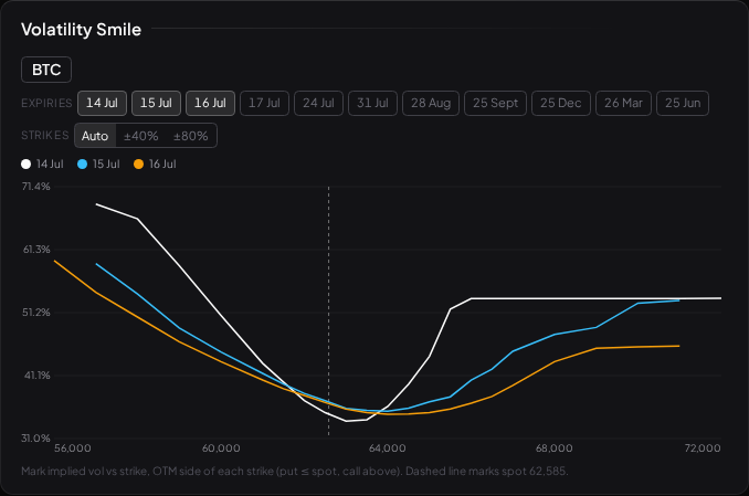
It reads the live BTC options chain (Deribit), the one live chain Visor carries today. For equities, the Options Calculator's vol input is yours to supply until a licensed chain is wired up.
What the curve is
Back the implied vol out of every strike at a single expiry (Implied Volatility explains the inversion) and plot IV against strike, and you do not get a flat line. You get a curve — a smile, or a lopsided skew — with out-of-the-money strikes carrying higher implied vol than at-the-money ones. That shape is the market's admission that returns have fat tails: big moves, and crashes especially, happen more often than the tidy Black-Scholes world allows, so traders pay up for the wings where the model most under-prices risk.
Reading the widget
- One line per expiry. The widget overlays a coloured curve for each selected expiry, defaulting to the nearest three, with a colour legend above the chart.
- A dashed spot marker shows where the money is, so you can see which strikes are OTM.
- The out-of-the-money side of each strike. At any strike the chain carries both a call and a put, whose mark IVs are near-equal under put-call parity but can differ at the margin. The widget plots the OTM contract — the put at or below spot, the call above — because that is the more liquid, more reliably-marked side. The result is one clean curve per expiry instead of two noisy overlapping ones.
Two controls shape the view:
- Expiries — a multi-select picker; toggle any set of expiries on or off to compare near versus far.
- Strikes — the axis window. Auto (the default) fits the axis to the plotted points, which reads clean because the near-money default already sits near the money. ±40% and ±80% clamp the axis around spot — useful for the one case that stretches the chart, overlaying a far-dated expiry (whose listed strikes reach the far-LEAP wall) alongside near ones. There is no log mode here: the smile is a near-money shape, so the honest fix for a far-only selection is to deselect the far expiry, not to distort the curve.
What a change in the curve can — and can't — tell you
The shape is the information: how steep the skew, how the near expiry compares to the far, whether the smile is steepening or flattening over time.
- A steeper skew — the downside wing lifting relative to at-the-money — means the market is paying up more for downside protection, a picture of how it is pricing tail risk right now.
- A flatter smile means the wings and the body are priced closer together.
- The term structure — near expiry versus far — shows whether short-dated or long-dated movement is the more richly priced.
All of this is descriptive of the current pricing landscape. It is not predictive. A steep skew is the market's current price on downside risk; it is not a forecast that the downside will happen, and it is never an instruction. As with implied vol generally, reading the smile tells you what options cost across strikes and time — not what the underlying will do.
What to read next
- Implied Volatility — what IV is, realised versus implied, and the smile's fat-tail story.
- The Greeks — vega, the sensitivity that makes the whole curve matter.
- Black-Scholes — the constant-volatility assumption the smile is the market patching.